GET IN TOUCH

9 Creative Variables to Test In The Opening Hook of Your Meta and TikTok Video Ads

Videos can be expensive and complex to create. But they’ve also proven to be the most effective visual on most social media platforms. The stats don’t lie:

FREE GUIDE

How to Create UGC Ads That Convert

Our guide explains what user generated content is and what makes it good for ads.

At the same time, we also know that not every video is created equal. Far from it. You’re just as likely to fail with a bad video ad on these platforms as you are to succeed when your visuals and messaging hit just right.

And here’s the thing: as explored in our recent guide on creating a winning testing framework for video ads, you don’t have a lot of time to capture and hold your audience’s attention.

In fact, according to a meta-analysis we recently performed across 20 video ad campaigns, only 25% of users watch more than 5 seconds in any video across all of our advertisers. The average watch time for these same campaigns and users was between five and six seconds.

Make no mistake: getting the opening of your video ads right on Meta or TikTok is absolutely vital. Get it right, and you have a good chance of hooking your audience. Get it wrong, and little of what happens after the opening–even the best content–won’t matter much.

Naturally, testing your ads leads to better results. In our analysis, the fastest-growing advertisers created 11x more creative assets and saw an 11x variance in return on ad spend between their top and bottom-forming creative compared to their lower-performing peers. 

But testing every ad you have entirely 11 times can be hard. So, we’ve built a framework designed to help you think more methodically about your approach, working smarter instead of harder to create new ads at scale and identify winning components for future iterations.

It all begins with the first few seconds of your ad. That’s what makes these 9 testing variables so valuable when looking to optimize your ad’s opening.

Variable #1: Opening Visual

As its name suggests, your opening visual is the very first image or video frame your audience sees. If they don’t like what they see, they’ll move on without questioning it. But if they do, you’ve got them hooked for the more in-depth messaging to follow soon after.

In the below examples from Camp, a boxed mac and cheese brand, we tested four different potential opening visuals: 

  • a parent and child speaking to camera
  • a parent and child in an action shot
  • a child eating the product
  • a close-up of the product in a bowl 

Knowing which of these variables won allowed us to speak to our audience’s core needs and preferences from the first time they laid eyes on the ad.

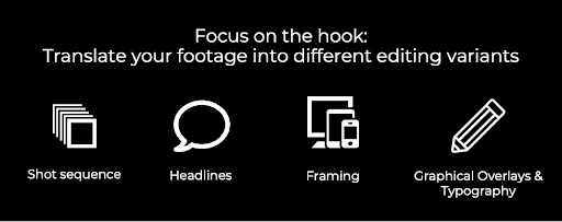
Variable #2: Opening Headline

The visual may be the most important component of a video ad’s opening, but don’t underestimate the role that a headline can play in driving different outcomes of the same visual. Once you find the best possible visual, you can also test out different wording and language that may be most effective alongside it for your audience.

In the below examples from our work with the beverage company Dune, we found the best-performing visual to be someone pouring the product into a glass. So, we iterated on that successful experiment through a number of different headlines to find the one best-suited to match that visual for performance.

Variable #3: Shot Sequencing

Your visual and headline combine for the first glance your audience gets at your video ad. Now, it’s time to think about what happens in the next few seconds after that first impression. In some cases, that second or third shot in the opening sequence may just make the difference in helping your audience take the action you need them to.

Anthem and hype ads are an especially good opportunity to test your shot sequencing, helping you test which order of the multiple creators trying your product will perform best. In below example for our client Transformation Protein, we tested how the order of introducing creators in a video impacted results. We tested with different creators in different positions in the video to find the optimal combination of sequencing.

Variable #4: Graphical Overlays

Some video ads require graphical overlays to convey additional context. That’s especially true for complex messaging, given the 5-second average view time of most Meta and TikTok ads. In these cases, adding product overlays or split screens can help to add vital information through product popups, slider elements, or making your product look like a collection ad.

In the two below examples from neon sign company Sketch & Etch, we tested showcasing different products and use cases alongside their videos to further add context around what they were selling to compel you to click and buy.

Another way you can incorporate graphical overlays is by using native-style interfaces to your ads. For example, in the below ad, you can see the use of TikTok’s reply function. Using native interfaces from these tools can add a vital social and conversational component to the environment that makes audiences more likely to tune in to watch more.

Variable #5: Typography

Any experienced advertiser knows: what words say isn’t the only thing that matters. It’s also how those words look, and whether you can use them to add a graphic element to your ad’s overall look. In other words, it’s about the typography choices behind any words, from headlines to overlays, that appear on your ad.

The font, colors, and background around your font can all be used to tell your story. In some cases, that might mean staying simple and sticking with your brand fonts, but don’t limit yourself to that. For example, using typography that feels more native to the platform might perform better than polished or stylized fonts. In this example, we switched the typography from big and bold in one video to more polished looking in the other.


Variable #6: Framing of Content

Some ad formats may allow you to place more than one piece of content in the opening. In that case, it becomes all about making the right choices and framing the content just right. After all, you want to use this type of style choice to put the focus on the main message, not distract from it or cause your opening to become overly busy. 

In this example, we worked with our client Transformation Protein to create a dual screen that included product movement at the top and simultaneous before/after pictures at the bottom for an immediate payoff.

Meanwhile, this example of a grid ad for Dune allowed us to show off multiple products all within the first second of viewing the ad.

Variable #7: Voiceovers for Reels and TikTok

If the video format allows it, the opening line in your video may just make the difference in hooking your audience. It’s not just about the words they say, either. It’s about who says it, and how that relates to your audience. For example, testing a male voiceover against a female voiceover can change performance and help you gain valuable insights into audience preferences.

How that narrator speaks the voiceover can also impact the performance of your ad. An over-excited VO can work with the right product and personality, but others may require a more calming voice that triggers an ASMR-like response. You can even test TikTok’s robot voice as a voiceover option to determine how performance increases or declines as a result.

Variable #8: Sound Effects for Reels and TikTok

As another auditory element, sound effects also make a core difference in the success of your video opening. In the right format, they can play alongside, add to, or take the place of voiceovers. The right sound effect, it turns out, may just be the difference in your audience scrolling past, or stopping by your video to watch it to completion. 

In this example, our mac and cheese client Camp used the sound effect of its product being poured into a pot and the sound of the mixing of cheesy noodles to capture immediate attention.

Other sound effects may lean more heavily into the ASMR concept, using sounds like squishing or ocean waves to capture a specific audience feeling that the ad will pay off as they keep watching.

Variable #9: Music in Reels and TikTok

The final type of auditory option to test in your opener is music. In fact, the option of adding music at all, as well as choosing what type of music makes the most sense, can both play a role in capturing audience attention and getting tangible results or improvements.

We recently performed a Meta split test for Reels video ads on two different advertisers, to see the impact music would make. While we didn’t see a statistically significant difference between both options, this has the potential to become a more important element for the opener in the future. In this example from our client One Golden Thread, we tested the same ad with and without music to determine audience preferences.

From Testing Video Openers to Optimizing Video Ad Performance

Creating video ads optimized for performance is complex, but testing can help to create a more efficient process with more reliable results and ROI. As a result, it can go a long way towards investing confidently, knowing your ads will attract attention and convert thanks to battle-tested openers.

The right testing strategy, in fact, can go beyond the campaign for which it’s implemented. Results for variations in opening shots, voiceover styles, sound effects, and the other components listed here can all lead to broader insights into audience preferences that can apply for future campaigns as well. The result is a more broadly optimized Meta and TikTok video ad strategy.

That sounds complicated, but it doesn’t have to be. A reliable partner by your side can go a long way towards making this testing strategy, and these insights, a reality. If you’re looking for help in testing and optimizing your video ad openers, get in touch with us today.

Ready to grow your business with Meta and Google ads?

Looking for help in strategizing and running your campaigns? Get in touch and we can help you revolutionize your digital marketing campaign.

Related Posts

How to Create UGC Ads That Convert

Claim your free copy of our guide, sent directly to your inbox

FREE eBook Download Offer: How to Create UGC Ads That Convert

Download the FREE eBook guide and create killer UGC Ads!

Get IN TOUCH

Subscribe for updates on the latest news and best practices in performance marketing!