
Running ads but not seeing strong sales performance?
While creative and targeting play an important role in driving people to your site, what happens after the click is just as crucial in getting someone to buy.
So where should you start?
Improving the bridge between your Facebook/Google/etc. ads and your website is easier than you think.
Just follow the three C’s of landing page optimization to improve your conversion rates:
- Continuity
- Content
- Call To Action
Continuity: How can you improve the flow between ads and landing pages so the experience feels consistent?
Make sure there’s consistency between the components that appear in your ads and the website they send people to.
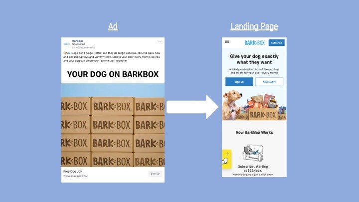
Let’s use the below ad from BarkBox and their landing page as a guide:
Ad and landing page components to connect:
– Imagery: In both the BarkBox video ad and their landing page, the packaging is clear and present. The dog in both the opening frame of the video and the top of the landing page are also similar. This visual consistency allows people to know they’re in the right place to continue their purchasing journey.

– Products: While it might seem like the right decision to send people who visit your site to the homepage, sending them straight to the product they’re interested in will allow those people to purchase what brought them there in the first place. BarkBox does a good job of this by showing their product offering up front. What you saw in the ad is what you get.
– Pricing and Promotion: If you’re promoting a sale or a specific price point in your ad, make sure that same price point is being reflected on you website as well. For example, if you say you give 10% off your first order in an ad, make sure that’s reflected in the site copy as well. Don’t assume people will know they need a coupon code or the discount is already applied. If you don’t include pricing in your ad, make sure you still keep that information front and center. While BarkBox doesn’t have direct pricing in their ad, they make it clear that you’re paying $22/month if you sign up. (Admittedly, they say Free Dog Joy as their headline which could confuse some customers on pricing if misread).

– Messages: The copy you use in your ad should be reflected in your landing page. Tell the same story before continuing on with more information for interested readers. BarkBox does this well. They tell customers in their ad “get original toys and yummy treats sent to your door every month.” Their website copy is similarly phrased: “A totally customized box of themed toys and treats for your pup – every month.” You know you’re in the right place which means you can continue scrolling to learn more about their offering.

– Design Elements (colors and fonts): Showing people the same colors and fonts they see in an ad helps people subconsciously realize they are in the right place. For example, you’ll notice the background color in both the video ad and the landing page for BarkBox is the same as well as the fonts.

– Call To Actions: People should expect a similar call to action between what they see in the ad and what they see on the website. For example, if you tell someone to “Shop Now” in your ad, telling them to “Subscribe” on your site could confuse the customer. (Note: BarkBox uses the “Sign Up” option in both the ad and the website but the “Subscribe” button in the menu navigation, could confuse customers. Realistically these primary call-to-action buttons should probably retain the same messaging.)

Content: Has all your content been optimized for mobile screens?
By 2021, analysts estimate 53.9% of all e-commerce sales will happen on mobile devices which means thinking mobile first is not only crucial to making a good first impression, but also to driving sales.
Before running ads, open up your landing page on your phone and ask yourself these questions:
– Is the headline attention grabbing? Make sure to use something that will grab someone’s attention and have them wanting to learn more. BarkBox’s headline “Give your dog exactly what they want” does this well.
– Is the unique value proposition obvious? State the key differentiator for your product that would make someone buy. BarkBox does this well by stating they are “a totally customized box”.
– Do the large images convey the main messages? Less is more when putting images on mobile. A big image that corresponds to your headline is a great way to help consumers connect what you’re selling with what they get. You don’t need to get fancy. For example, the variety of boxes with toys and treats combined with an image of a dog tells the consumer exactly what they should expect when signing up for BarkBox.
– Is the information concise and easy to read? Unlike on desktop, where we consume more text-based information, mobile is a much more visual medium. Keep your captions short and to the point. No more than 1-2 lines of text.
– Is the layout uncluttered? A landing page should offer all the necessary information, but not so much as to overwhelm (and potentially drive away) the visitor.
Call to action: Do your call-to-action (CTA) buttons inspire someone to progress to the next step?
Your call-to-action button is the bridge between the content your visitor is already interested in and the end goal you ultimately want them to take on your website: conversion.
Take a look at your landing page on your phone and ask yourself if your CTA button follows these guidelines:
– Is there a CTA button visible on the page? While this may seem obvious, some websites bury their landing page so someone has to scroll to find it. If you have to scroll to get to your CTA button, consider moving it up higher on your site so people can take your desired action easily. In the BarkBox example, you can see the “Sign Up” CTA button front and center for clicking and moving on to the next step in the purchase process.

– Is the CTA big enough to be easily tapped on your phone? On a phone, large buttons have a higher chance to be noticed and tapped on. A compelling CTA button should be big enough to be quickly found but not too big that the visual composition and hierarchy of the layout would be spoiled. Research on button size and spacing has discovered a standard that works for most users. If in doubt, consider a width of at least 72 pixels, which is the average width of the adult thumb.

– Does the color of your call-to-action standout? Buttons and background colors should be contrasting enough so that CTAs would stand out and grab your attention. The button should also look clickable which can be done by adding borders, white space and shadows. In the BarkBox example, the team uses a dark blue button to contrast the white background through the majority of the site’s layout.

– Is the CTA “sticky”? Scrolling behavior varies depending on the content a visitor is interested in. If someone ends up somewhere in the middle of your page, your button needs to be visible at that moment for them to take action. Using a “sticky” CTA button solves this problem by sticking to the top or bottom of the screen and stays with users as they scroll. It allows them to take action whenever they’re ready. BarkBox uses this well in their navigation bar. Even as you scroll, you always have the option to click and “Subscribe.”
Conclusion
While ads drive site traffic, strong landing pages are still required to convert those visitors into customers.
By following the landing page best practices listed in this article, you’ll know exactly what elements you’ll need to build high-converting mobile landing pages for your ads.
Just remember the three C’s: continuity, content and call to action!