Mobile already makes up just over half of all internet traffic, and this isn’t likely to change any time soon. It’s expected that by 2025, mobile traffic will have increased by another 25%.
Despite the increase of mobile-responsive sites that are designed to offer full functionality cross-device, the reality is that mobile and desktop don’t truly yield equal experiences across the board.
In this post, we’re going to take a look at why the mobile site experience is so important and seven different often-forgotten mobile website considerations you need to keep in mind when designing your site.
Why the Mobile Site Experience Matters
Users are discovering, browsing on, and purchasing from brands on mobile sites at increasing rates, and your site needs to be ready. This includes everything from your landing page to your checkout process.
There’s plenty of data to back this up, including the following:
– Target found that 75% of customers are starting their journey on mobile, even if they later went into the store or made a purchase on a desktop site.
– According to Shopify, 69% of their 2019 Black Friday and Cyber Monday sales were made on mobile devices; only 31% were on desktop.
– Conversions from smart phones had increased in 2020, partially thanks to increased online shopping from COVID but also likely thanks to easy pay options.
It doesn’t matter if you as the business owner or site designer created the site on desktop; it’s important to remember that your site will likely be mobile-first access for many customers. And since mobile has more limitations around functionality and ease-of-use, it’s essential to consider site design with that in mind.
The 7 Mobile Site Considerations That Often Go Ignored
There’s a lot that goes into creating a functional, high-converting website with a great user experience. It’s easy for brands to sometimes overlook a few key considerations, so let’s take a look at seven qualities you don’t want to forget when it comes to the mobile website experience.
1. Site Loading Speed
We know that site loading speed matters on desktop, but are you testing site loading speed for mobile, too?
Even more importantly, are you testing site speed on both mobile data and mobile wifi? That matters, too.
53% of mobile visits are abandoned if the site takes more than three seconds to load. Since mobile sites are likely to be a customer’s first touchpoint in many cases, this is a major consideration.

Sites that load quickly on desktop may not load fast on mobile; you need to double check. Sites like Pingdom and Google’s PageSpeed Insights allow you to check your desktop site and your mobile site separately so you can be sure that you’re falling under that three-second mark.
2. A Thumb-Friendly User Experience
Unsurprisingly, 75% of smartphone interactions come down to thumb scrolling on a touch screen. People don’t want to need both hands to navigate a site.
This means they need to be able to easily click on your CTAs, navigation menus, and search bars with a single tap. It cannot be a hassle to use your site, or people just won’t.
Think about those navigation bars that require you to hover over options in order to open (and keep open) additional menu options; this doesn’t work on mobile, when a user would need to take their thumb off the menu entirely to review other options and select something else. The site would quickly become too complicated to use.
Branding Brand has an outstanding template that allows you to consider what thumb-only navigation looks like on your site, which you can see here:

The basics of the strategy focus on knowing your “Thumb Zones,” which is where it’s most comfortable and likely for users to take action on a mobile device. You can see this in the diagram above, and includes the following:
– You should always place primary CTAs in the primary zone.
– Essential information and secondary CTAs (like “learn more” instead of “shop now”) should be placed in the secondary zone.
– Controls to change the mode or initiate different tasks (including search, privacy policies, and navigation menus) should be in the tertiary zone.
This reduces friction by establishing a hierarchy, keeping the subconscious engaged and it maximizes the “tappability” of your content.
It’s also a good idea to have CTAs that are wide enough to click, and easily visible.

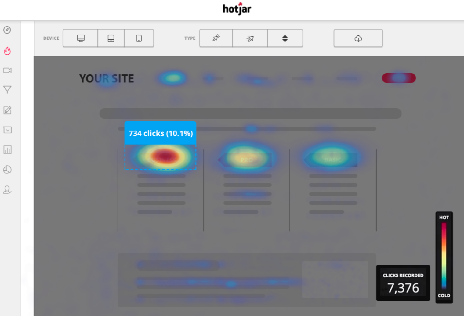
You can use site mapping and behavior tracking tools like Hotjar to assess mobile behavior and flag potential issues that may need to be addressed.
3. Comprehensive, Simple Navigation
Complex menu systems that require drop-down menu after drop-down menu are difficult to navigate on mobile, especially when they’re not thumb-scrolling-friendly.
Simple and intuitive navigation is essential, and it’s important to consider the navigation experience on mobile just as you would on desktop.
Simple navigational menus, filtering capabilities, and an easy-to-access search bar are important. Customers may have trouble finding your return policy through drop-down bars, for example, but can easily find it with a quick search if you have this enabled on your site.
Make sure that you have someone test your mobile site to see if they can find everything they need, including information about both your brand and products. Sometimes they can help flag issues that you may have otherwise missed before it costs you customers.
4. Social Proof That’s Visible on Mobile
In some cases, mobile sites will choose to reduce site elements like visible reviews, UGC, press links or logos, or counters that show the number of customers served. They do this in attempt to speed up the mobile site and keep it “cleaner.”
These aren’t “afterthoughts” that are only added onto a desktop site to make it look great, however. They’re valuable, powerful driving forces that can directly impact sales, just as they are on desktop. And if customers don’t see them on mobile, they will likely assume that you just don’t have them at all.

This is not the area to make cuts. Instead, chose mobile-friendly tools for displaying social proof, like Stamped (pictured above), which is designed to be mobile-responsive and search-friendly.
5. Incorporating Live Chat
When you enter a storefront, you have a helpful salesperson who can step forward, greet you, and help you find the right product.
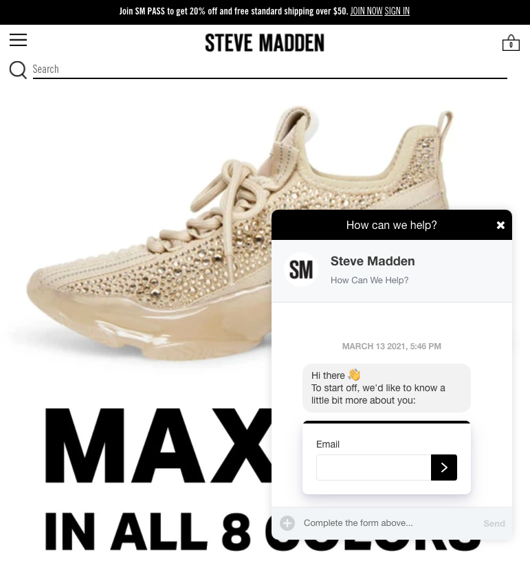
That isn’t readily and immediately available online, which is why live chat is so important on desktop and mobile. A quick greeting and an offer to answer questions can get users chatting with an AI and even a customer service or sales representative to answer questions and direct them towards the right products or services.

When you lack a live chat on your mobile site, you could miss a chance to capture buyer intent in real-time and close sales faster.
When it comes to live chat tools that are mobile-friendly, we recommend Gorgias. It’s easy to use and it integrates with most major eCommerce platforms, including Shopify.
6. Offering Mobile-Friendly Payment Integrations
Nobody is thrilled at the idea of needing to enter their billing information, shipping information, and credit card information from their mobile device. Offering mobile-friendly, instant-pay options are important to increasing mobile conversions.
These are secure and convenient, and well-trusted by customers. One study found that adding these payment options resulted in a 68% increase in mobile conversions and mobile purchases.
There are plenty of options available, including the following:
– PayPal
– Shop Pay
– Klarna (which also lets customers divide up their payments)
These options all allow participating users to save their information (credit card info included!) so that they only need to enter their email and verify their identity to have the checkout process auto-completed.
Some platforms let you have multiple payment options enabled, making it even more accessible to as many customers as possible.
7. Prioritize Visuals
When mobile sites were first becoming a necessity, there was some advice online to cut visuals (including videos and images) left and right in order to speed up site loading times.
This is actually the last thing that you want to do. When possible, prioritize visuals over text, especially for eCommerce businesses. Visuals are easier to view quickly on mobile, and with better mobile technology, many users are able to handle images on their devices without a problem.
And when it comes to text on mobile, less is more. You want to give users enough information to feel confident in purchasing, but you don’t want to drown them out in blocks of text that are difficult to read on mobile. Skipping the long-form sales copy is the way to go.

When in doubt, split test your site design and the text and visuals you have on your page. You can use tools like Unbounce to A/B test different versions of your site to make it more mobile-friendly.
Final Thoughts
It’s not enough to simply have a mobile site anymore, like it was even five years ago; customers have higher expectations for mobile sites, meaning that you need to approach your entire sales funnel and your landing page itself as a mobile-first experience.
We’ve seen too many brands sabotaging not only great ad campaigns but great products by driving away customers with poor mobile website experiences. Check your site for the seven considerations we discussed in this post to strengthen the user mobile experience (and your chance at conversions) moving forward.
Your Facebook Ads can’t do their job if you don’t pay attention to what happens after the click. Learn more about our holistic approach to paid social here.

