In performance marketing, a great creative and targeting approach is just the beginning—in fact what happens after you win the ad click matters just as much. The web experience served up to an intender can significantly increase or decrease the conversion rates of your desired action such as a lead submission or product purchase. Therefore landing page testing can be a huge lever in terms of reducing advertising acquisition costs and improving your ROI.
Of course, and as with any data-driven digital marketing approach, testing your landing pages cannot be random.
You need to understand the ingredients of a winning approach and you need to know which landing pages to prioritize testing. This guide will help with both of these elements.
FREE GUIDE
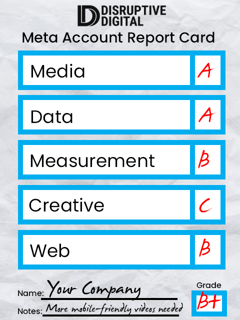
Meta Account Report Card
Your path to success begins with the Meta Account Report Card, your key to unlocking unparalleled insights and maximizing your social media presence.
Testing Considerations: The 3 C's of Landing Page Optimization
As you build your testing strategy, keep it simple by focusing on the 3 C’s of Landing Page Optimization:
- Continuity, or the ways in which your audience can flow and transition from ad to landing page. Ensure a smooth experience through imagery, copy, design elements, sending users directly to the products you’re advertising, consistent pricing that matches expectations and calls to action that match the ad.
- Content, particularly focusing on mobile-friendly design and copy that grabs audience attention from the first headline, makes your value proposition obvious and combines text with large imagery. Uncluttering your layout can also help to make the content more digestible and the conversion more likely.
- Call to Action, inspiring your audience to easily move to the next step of the conversion. Consider your CTA the bridge between the content they want and the goal step you want them to take. Any button needs to be clearly visible, easy to tap on a phone, contrasted against the background, and sticky enough to stay with your users as they scroll down the page.
The 5 Types of Landing Pages You Need to Test for Effective Performance Marketing
The 3 C’s of Landing Page Optimization are a great intro to testing, but most marketers know that landing pages are at their best when they’re specific. And specific pages have different needs. We’ve seen these five types of pages work particularly well in driving audience actions, making them a great priority to improve performance.
1. Product Overview
Perhaps the most straightforward type of landing page, this option gets straight to the point. It works well if you’re directly promoting a specific product via ads.
For this type of landing page, visuals are essential. You have to get the purpose of the product you’re looking to get across, quickly via photo/video. Another key component is social proof (reviews and testimonials), which will make your audience feel more comfortable about clicking the buy button.
And speaking of that button: the more straightforward, the better. Make it easy and obvious for your audience to find the place they need to click to get the product.
2. Quiz Page
A quiz page is a great lead-generation tool. It immediately expresses personalization to the intender and if they choose not to buy immediately, you can leverage this information for remarketing tactics whether that be for paid ads or marginal cost marketing like email/SMS. Testing elements for a quiz page can include:
- The topic you’re asking questions about, based on user interest
- The framing of each question you’re asking
- The overall length of the quiz
- How you break up the quiz, from dynamic single-question screens to a single page listing all questions
- Any post quiz summary page should provide a clear and obvious next step to take action based on the answer provided
3. Listicle
You’ve seen them everywhere, and it’s because they’re undeniably great for SEO. But listicles, used and optimized the right way, can have a major impact as landing pages for your digital ad campaigns.
In terms of testing elements, the right topic is again crucial. So is finding the right balance of items to make sure your audience pays attention and is satisfied with the content without dragging on too long. A dynamic design, including jump links to later portions of the listicle, can also help.
4. Advertorial
Long a staple in all forms of marketing, advertorials can bring a sense of credibility to your ads. They provide a more in-depth view into a topic of your choice and of interest to your audience.
As a testable landing page, they can be more complex to manage. Conversion opportunities have to be subtle, as audiences likely want to focus on the content rather than the sale. Testing that balance—such as the inclusion of lack of a CTA, product vs. general images, etc.—can provide insights into how to best build your advertorial landing pages.
5. Us vs Them
Finally, and increasingly popular, are Us vs. Them pages that don’t shy away from comparing your product or service to a competitor. This type of page is specifically designed to help users already considering your product and should be designed and tested accordingly. For example, you can:
- Test whether a visual comparison or table-based comparison sees better results
- Test the individual elements included, like features or pricing, as part of the comparison
Build the Right Landing Page Testing Strategy for Sustainable Optimization
There is no such thing as a perfect landing page. But you can build a great testing strategy to ensure that over time, the destinations to which your ads send your users become better and better in driving actual, sustainable results. From product overviews to Us vs. Them pages, and from listicles to advertorials, continue testing and optimizing to ensure a sustainable ROI for all of your digital campaigns.


